Projector-Camera Systems: Here Be Dragons
By Ali Rahimi
Cameras and projectors yearn to be merged. Both have pixels, similar frame rates, resolutions, and fields of view. The instinct to merge these technologies goes back decades. Its devotees rally under the moniker “PROCAM”.
Here are some imaginary pitches for consumer PROCAMs: “We can make everyday surfaces look smart/alive!”; “We can present our platform to our users in new magical ways!”; “We’ll delight users by bringing them closer to their data”; “We’ll seamlessly meld the digital and physical”; “It’s augmented reality without a clunky face-computer”; “It’s the fourth screen in your life!”. I’m making up these quotes, but all of them sound faimilar to me. As exciting as these pitches may sound, they avoid answering the hard questions: What customer pain point are you solving? How do you know that customer is willingness to pay? And why do projectors provide the right engineer tradeoff?
This article is about consumer PROCAMs and why they haven’t taken off. I believe the instinct behind PROCAMs is sound. I’ve been involved in PROCAM projects four times in my career, in both small and large companies, sometimes as a founder, sometimes as an engineer, and sometimes as a spectator, holding back the urge to jump back into the ring.
Most commercial ventures fail because there are many more ways to fail than there are ways to succeed. I suspect the failure rate of PROCAM projects is not much worse than that of any other high-tech endeavor. But PROCAM projects seem to have similar failure patterns. My hope is to document these failures so someone can find a way through the pitfalls and build a PROCAM that takes the world by storm.
What projector-camera systems look like
There is joy in watching a wall, a tabletop, or even a shoe, respond to touch. The instinct to animate everyday objects seems fundamental. This might be why PROCAM projects are pitched so regularly in so many different forms.
Microsoft Lightspace project probably went farther than any other to showcase what PROCAMs could do:
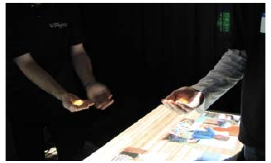
Lightspace engendered a number of other successful projects at Microsoft, but Lightscape itself wound down over time.
Other companies expanded the projection surface beyond Lightspace’s walls, hands, and tabletops, onto buildings and landscapes (examples below are from Obscura Digital and Lightform):


These companies showcased what PROCAMs can do in the hands of professionals and researchers. But this article is about consumer PROCAMs.
Here is one PROCAM that projected on windows:
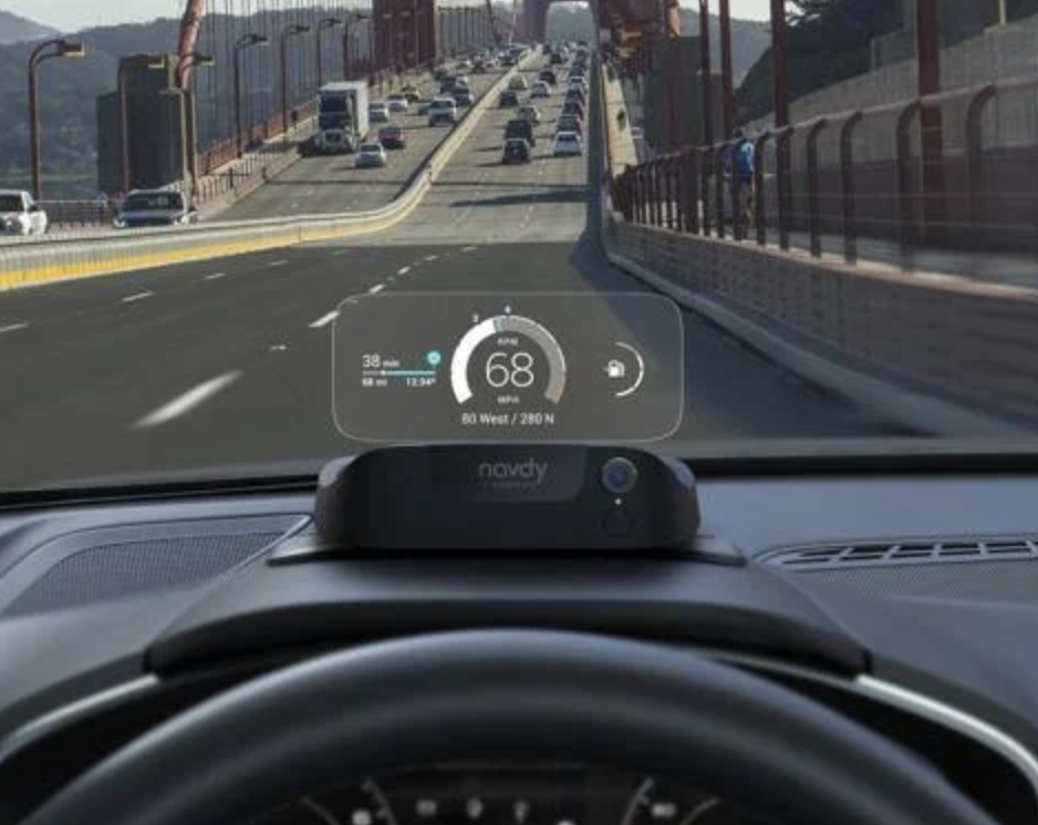
This was Navdy, an after-market head-up display (HUD) for cars. It had a projector, a camera, and all the other components you’d expect from a PROCAM.
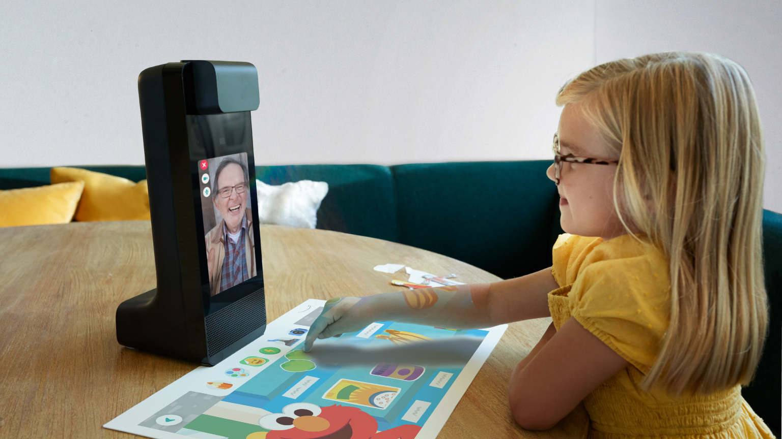
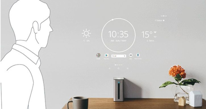
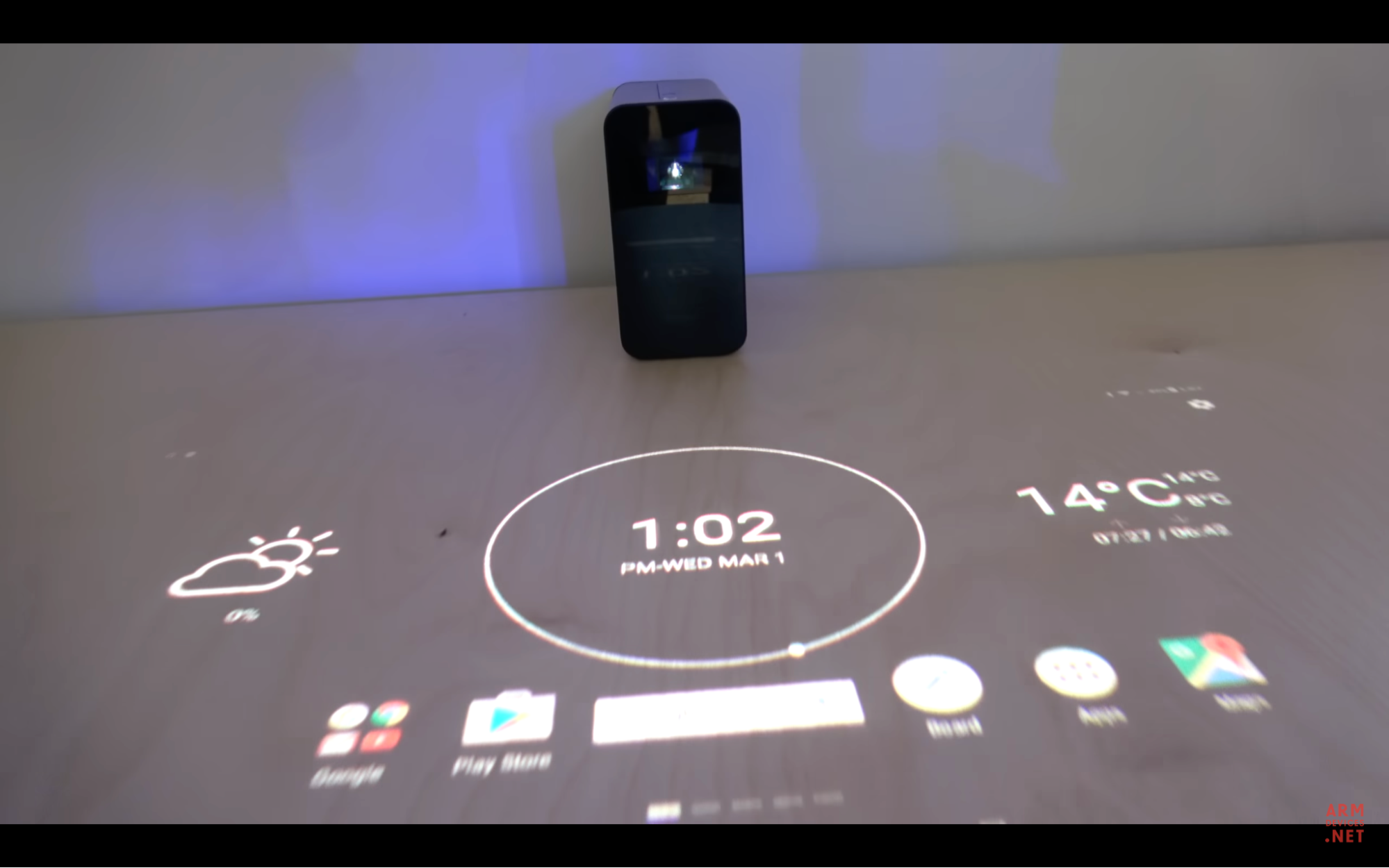
Here is Amazon’s Glow, a tabletop PROCAM that projects on tables:
You can play games, or make video calls with it. Here is Sony’s Xperia Touch, designed to project either on a wall or on a table depending on how it’s oriented:
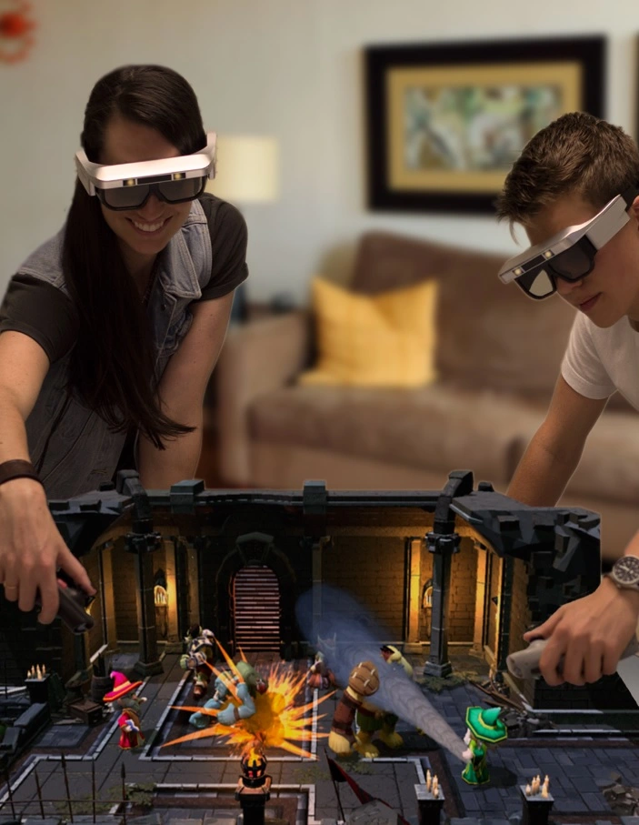
CastAR were augmented reality glasses. Instead of shining light directly from the glasses into your eyes, they projected light onto a special a retro-reflective mat. The mat then bounced the light into 3D glasses. In some ways, this is a much simpler optical design than most augmented reality glasses.
My own involvement in PROCAMs started academically in grad school. PROCAMs were in the air in the early 2000s. Later, I worked on Navdy, which had aspirations of being the first Augmented Reality Head Up Display (I don’t think we ever publicly called it that). I also worked in a big company on a device with a similar audience and aspirations as the Amazon Glow and the Sony Xperia, though not on those specifically. Our device never shipped. I also designed displays for home assistant devices (like Alexa and Google Home), hoping to turn them into a new generation of PROCAMs. That also didn’t take off.
What goes wrong with Consumer PROCAMs
PROCAMs fall in similar pitfalls as any other technology projects:
-
Forgetting what problem you’re solving for your customer, and whether they’re willing to pay you for it. This is a dodge: “Once they get a taste of our technology, they’ll be begging us for it”. Especially with PROCAMs, this particular leap of faith tends to end badly.
-
The competition from phones and tablets is stiff. If a tablet can get the job done even partially adequately, a PROCAM will likely lose. Instead of picking a head-on fight with a entrenched incumbent, compete in a market it cannot currently serve.
-
Mind the inherent limitations of the technology. Projected images have lower fidelity than an image displayed on an OLED or LCD panel. This is partly due to inherent limitations of projection. No amount of research and development can bridge this gap. The pitfall is to fall in love with your technology and discount its limitations.
I’ll elaborate on each of these in more detail below.
What problem will you solve for your customers, and are they willing to pay for it?
The pitfall is to focus on how the technology works and what makes it cool, and to delay solving problems for a real customer. This is a subtle pitfall. Everyone believes they’re solving a problem for a real customer. The subtlety of the trap is what we really mean by a “real customer”, their “problem”, and what it means to “solve” it.
If your main pitch is that your PROCAM makes something “seamless”, “delightful”, or offers “natural interactions”, there’s a strong chance you’re either not solving a real problem, or your customer isn’t real. These quotes superficially sound like benefits to their customers, but they’re actually attributes of the technology. “You will finish your work faster”, “it’s cheaper”, “other people will find you more appealing” are statements about customer problems and their solutions.
Navdy tried to be many things: “A driving companion”, “the embodiment of your phone in your car”, “an Augmented Reality HUD”, and “a driving GPS”. Internal teams found these concepts useful. The concept of a “driving companion” is helpful for a UI designer trying to choose an aesthetic. “The embodiment of your phone in your car” is helpful to decide how much of a phone’s capability to replicate in Navdy. “Augmented Reality” was a way to embolden the optical engineering and computer vision teams to think beyond standard HUD designs. “Driving GPS” is what convinced the team that it was ok to use a very expensive GPS chip inside Navdy. But none of these concepts represent a need from a customer.
As useful as these concepts were for the Navdy team, “I want my phone embodied differently” isn’t a pain drivers feel. “I want my reality more augmented” is also unrelatable. People seem, by and large, to be satisfied with their phones as navigation devices. But within that satisfaction lurk minor pain points: When you drive, you sometimes miss a turn because you split your attention, and often even put people’s lives in danger. Your eye has to change its focal length as you glance between the road, your phone, then back. That adjustment takes a few seconds, which means the road is briefly out of focus. You also waste time looking at your phone while your eye is out of focus. These moments of defocus are dangerous. With a HUD, you don’t have to refocus your eyes because the image plane is near the road. Touchscreens are also dangerous. They force you to look away from the road and take your hands off the wheel. You interacted with Navdy with a wheel-mounted dial widget so you could keep your hands on the wheel at all times. These are real but relatively minor painpoints. Most drivers won’t pay much just to be marginally safer drivers, unless the product makes them feel safe. And I don’t think Navdy ever optimized for the feeling of safety. In fact, I once asked our UX lead to deprioritize a safety study he wanted to undertake because we were already a year late shipping, and I wanted the team to focus on shipping. Navdy’s mission was never clearly about safety. We were wrapped up in how cool it was for too long. Had we started with customer safety pain points sooner, we could have honed the marketing, and trimmed Navdy’s original list of features much more quickly and more aggressively. This would have given us more time to make Navdy’s focal length longer, its field of view larger, to shrink its body, and more importantly, its price tag. All of this would have been in the service of helping drivers stay attentive to the road. These improvements were relegated to Navdy 2, which was never to be.
Focusing on customer pain points is a skill. One learns it like any other skill: by training and developing new instincts. Without training, one resorts to old instincts, and most of these instincts probably come from ingesting advertising. Ads that directly tackle a customer pain point are rare. Here’s an early one from Apple:
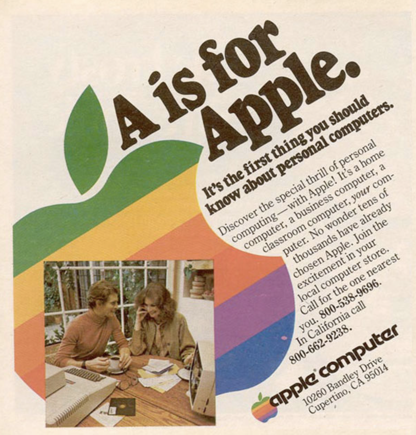
The pain point amounts to “PCs are hard to learn. Apple makes it easier.” It is straightforward. It’s rare for consumer electronics ads today to explicitly call out the pain point they tackle. Ads for established product categories, like computers, tend to focus on specs (clock rate of the CPU, number of cores, amount of RAM, etc). These specs are a short-hand for well-understood consumer pain points. For example, “more RAM” is generally understood to solve the problem of computers stuttering when too many programs are running.
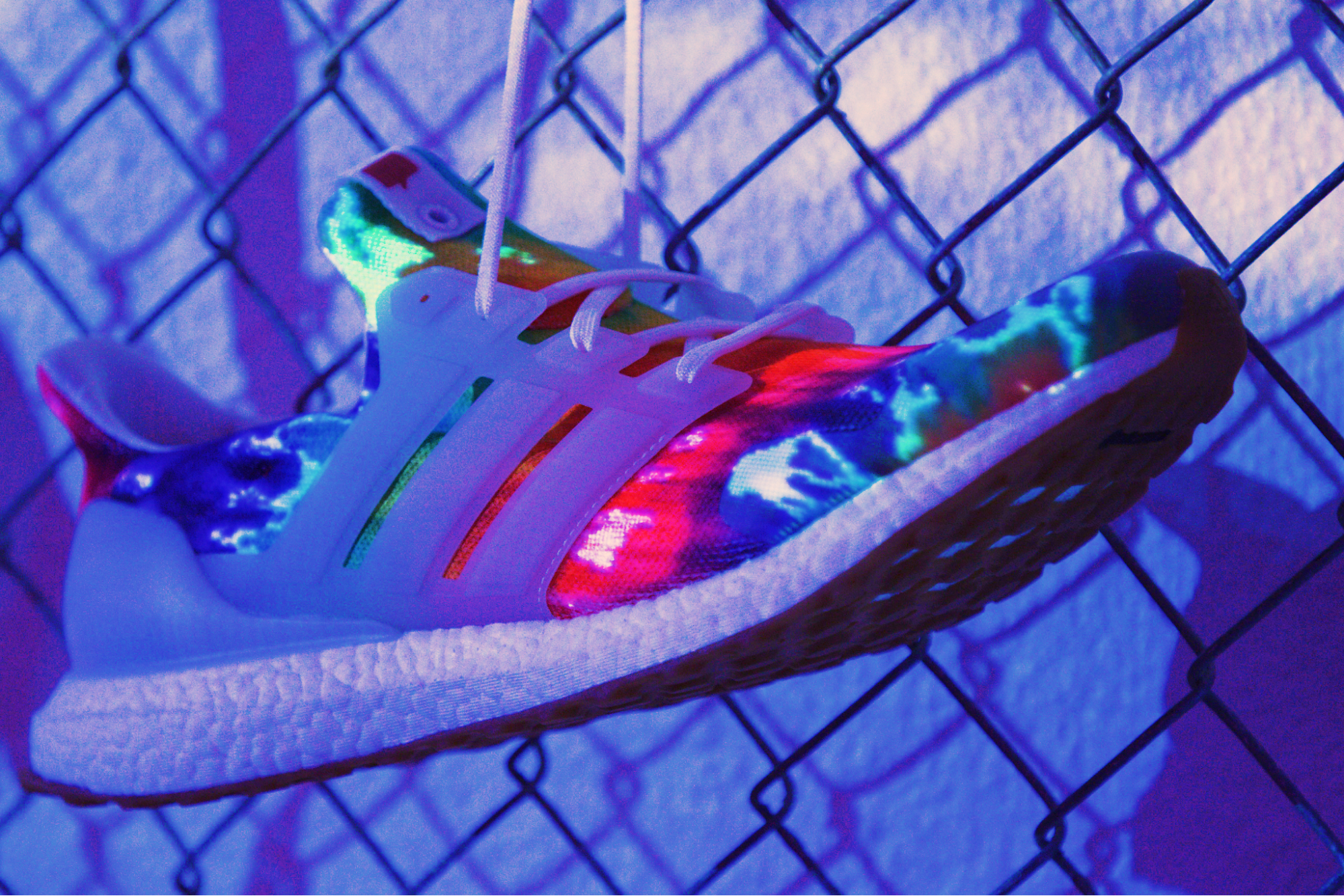
Some ads can be even more removed from pain points. Here is an ad for a shoe, I think:

It doesn’t mention any specs. It doesn’t even indirectly allude to a painpoint. This ad itself is part of the product. When you wear a Nike product, you’ll think back to this ad and feel more … whatever this ads wants you to feel.
Learning marketing by consuming advertising is an unreliable way to learn to spot customer pain points. So is reading press coverage of a product. There are excellent books that teach you to identify, think about, and relate to your customer’s pain points. Anything by Steve Blank is a good starting point. I appear to be saying that consumers are mercenaries with well-defined pain points and missions with clear economic agendas, and that the soul of a product is irrelevant to them. To a first approximation, I’ll in fact claim exactly this. I think it’s a helpful mental model for product development and a less misleading one that the one engineers learn from exposing themselves to the barrel-end of advertising or the popular press.
The usual counter-argument against what I’m saying is that consumers do adopt radically different technologies when they’re sufficiently magical. Nest thermostats, Apple watches, and the iPhone are offered as examples. These products replaced well-established incumbents despite costing much more. Couldn’t PROCAMs gain adoption the same way? Yes, they could, but all those devices did two things: 1) They solved an important customer pain point that the incumbents weren’t addressing, 2) They marketed themselves as aspirational products. That they pursued both approaches is what makes them confusing. It’s tempting to think that people buy them for the magic, but their value propositions is straightforward. The iPhone finally made it possible to browse web pages on the go the way they appeared on desktops. The alternatives at the time were laptops with GSM radio dongles, or Nokia and Blackberry phones with small screens and a web proxy that reformatted web pages. Nest thermostats updated the outmoded bakelite aesthetic that Honeywell had popularized. Nest’s haptic dial and its beautiful central display were technological enhancements that solved an interior design pain points. Smart watches appear to solve primarily one pain point: receiving notifications. This seems to be both the reason people purchase these devices and how they actually use them long after their purchase (see 1, 2, 3). Some believe they also solve an aesthetic problem, or help with fitness, but the studies I cited contradict each other on these points.
My point is that even soulful products tackle customer painpoints explicitly. Their ads tend to be aspirational, so we don’t notice when they materially improve our lives.
By the way, the Nike ad above has an impressive projected effect. The projector appears to be projecting darkness instead of lightness. More on that later.
The competition from phones and tablets is stiff
The main competitor for a PROCAM is often a phone, a tablet, or a computer with a large external monitor. I believe that if these devices mostly solve a customer’s problem, PROCAMs will not gain ground on that customer problem. For similar optical performance, OLED and LCD panels are roughly 10x cheaper than a projector. They don’t have problems with unintentional shadows being cast on them. Their touch screens are also cheaper and more precise than the sensing technology that detects and localizes touch in PROCAMs. Admittedly, these economics aren’t inherent. They’re reflections of the current economies of scale of display panels, and this balance could shift in the future.
But maybe because PROCAMs are special-purpose, they remove friction compared to these incumbents? It’s tempting to claim advantages like “more natural”, “frictionless”, “more delightful”, or “higher tech” to this list of attributes. Here is the cost of being special-purpose: Users have to purchase, install, learn, and maintain an additional piece of hardware. To use a phone, they have to install an app. To overcome this friction, PROCAMs need more than just being “more natural”. They need to solve painpoints other devices can’t address.
Navdy, Sony Xperia Touch, and Amazon Glow tackled domains that are already partially serviced by phones and tablets. Navdy competed directly with Google Maps running on a cell phone. Navdy had to provide enough value to compensate for its hardware cost, the time it took to install it in a car (about 30 minutes), learning its user interface, and giving up on Google Map’s countless features. I don’t think we managed to make Navdy so useful that it compensated for its setup cost and price. The Sony Xperia Touch ran Android, and I also personally found it less convenient than a standard tablet that cost 5x less.
Before you build your PROCAM, try to implement the solution to your customer’s problem on a tablet first. Does your tablet app seem to solve the problem adequately? If so, congratulations! Please market it and grow it as an app. If your tablet app doesn’t take off, it might be a sign you’re tackling a problem your customers don’t value. But if you really believe your app isn’t taking off because it needs a projector, then I’ll acquiesce. But there is an enormous landscape of pain-points that are completely unaddressed by cell phones. Why not start with one of those instead?
Mind the inherent limitations of projectors
Projector magically turn a surface into a display. But it’s important to understand the limitations of that display. First, projectors cast shadows when a hand or a head is in front of it. This annoyance is often overlooked. Second, projectors can’t generate black pixels. When a projector pixel is off, you see the color of the screen, which is usually white. In a dim enough environment, this not a problem, but in typically lit environments, this results in poor image contrast, especially compared to that of OLED displays. To compensate for these effects, movie theaters are pitch black (1 lux, dimmer than the dimmest reading of professional light meters). Both of these effects are inherent to projection. Future economies of scale and technical innovations are unlikely to solve them. These effects dilute the magic of projection, particularly for audiences who are accustomed to the image quality of OLED panels. The solution is to adopt a more nuanced mental model of what projectors do. “A projector is millions of tiny spotlights” conveys its limitations more fairly than “it turn any surfaces into a display”.
PROCAM teams recognize these issues early on, but often don’t grapple with them until it’s too late. Here is the Amazon Glow marketing image again:
The screen on the table is white, but Elmo’s eyes are implausibly black. The pixels of a projector can’t be darker than the background. Somebody Photoshopped this image! The team seemingly recognized that a compelling experience needed black pixels. But because physics was unyielding so they resorted to Photoshop.
The flip side of the black pixel problem is that projectors have dismal contrast under typical lighting. Here is the Sony Xperia at CES:
The walls of the booth are white, yet they appear gray. The walls of the booth had to be extended to the ceiling of the convention center to block off the ceiling lights and dim the booth enough to create adequate contrast for the projector. In the image below, the scene is so dim that you can barely see the Xperia Touch:
Shadows are a real problem with projectors. Here is a screen capture from a demo video from Charbax playing with the Sony Xperia Touch at CES:

Here is another image from Sony’s marketing team:

In this image, the shadow makes the text implausibly dimmer instead of completely occluding it. The team seems to have recognized the problem with shadows, but they couldn’t solve it. They Photoshopped their way around it in the short term.
It might seem unkind of me to have called out Photoshopped demos of PROCAMs. My intention is not to embarrass, and I hope no one is embarrassed. I’m instead illustrating how reluctant we are to accept the limitations of projectors. A marketing Photoshoping a demo, or building a custom booth to cover for the shortcomings of a product is strong feedback to the product team. If a marketing team is having to do this for the product team, the product is unlikely to succeed. The solution is to pick problems where these limitations aren’t problems. A PROCAM might just not be the right tool for the job if you keep running into problems with contrast, shadows, and black pixels.
Back to this Nike image from earlier:
The words “JUST DO IT” follows the contours of the athlete. It seems to be project. And yet the text is black! Earlier, I claimed projectors can’t display black. How is this image possible? I am guessing the projector is the only source of light in this scene. When the projector is off, the room is pitch black. The projector is shining light everywhere except on the letters “JUST DO IT”. The tiny pores in the concrete wall corroborate this guess. When a concrete wall is illuminated with a diffuse light source, its pores don’t appear as black dots. But when these indentations are illuminated from a point source, parts of them receive no light and appear completely black. I find this image simultaneously clever and a helpful reminder about the limitations of projectors.
Conclusions
I believe in PROCAMs and I want to see a successful one. The pitfalls I’ve pointed out are the ones I’ve seen repeatedly, but they seem straightforward to avoid. They amount to a few lessons.
Don’t get wrapped up in the science fiction of PROCAMs. Focus on a precise customer pain point. In defining it, avoid language like “delight”, “reduce friction”, or “magical”, and focus instead on the more mundane language of “pain point and willingness to pay”. A problem not worth solving is not worth solving using a PROCAM. Don’t try to solve pain points that can be even remotely addressed by phones or tablets. These technologies might not solve the problem perfectly, but their availability, familiarity, and convenience gives them an insurmountable incumbent’s advantage. Treat the physical limitations of the projector as first class design constraints from day one: How will you avoid needing high contrast? How will you avoid needing black pixels? How will you avoid shadows?
I offered examples of PROCAMs that avoided many of these pitfalls. For example, Navdy and CastAR engineered their projection surfaces. Obscura Digital runs their installations at night to attenuate ambient light.
Here’s one more word of caution: Ignore the exuberance of your investors and bosses. They’re enchanted by your vision because your demos are breathtaking and spectacular. They’ll agree to give plenty of rope to hang yourself. Their exuberance is not a validation of your product idea. It’s merely validation that PROCAMs are magical, which is an already well-established fact. You and your investors are enmeshed in the same trance. Focus on the task at hand by asking the hard questions: What customer pain points does your product solve? Why can’t phones and tablets solve it? How will you avoid tilting against fundamental limitations of projectors?
Appendix
This essay made some technical claims that I’m relegating to an appendix:
- Why projectors have inherently worse contrast than OLED panels.
- Navdy probably didn’t need to have a projector. It could have been an OLED HUD.